Amazon Prime Video
Kids Streaming Area
User Problem
How might we help kids and their parents find safe, age-appropriate and interesting shows and movies that don’t come at any extra cost?
Business Goal
Increase engagement with kids content, make kids content easier to find, and reduce customer service contacts caused by offensive/inappropriate content or accidental purchases by kids.
Solution
A dedicated kids area with editorially curated, kid-friendly content that the user is already entitled to with no additional purchase
Skills
Prototyping, wireframing, mockups, usability testing, personas, scenarios, content strategy, A/B testing, statistical analysis, project management
Overview
A dedicated area for kids to safely stream content meant for them
My role
UX Designer, Content Strategist
Platforms
Android, iOS, Fire tablet, Fire TV stick, desktop, mWeb
Duration
5 months
Collaborators
Harmesh Bhambra, Enoch Chun, Prime Video UX Research team
Tools
Sketch, Photoshop, Invision, Weblab (Amazon’s proprietary A/B testing tool)
User Problem
During focus groups, interviews, social media, and customer service calls, parents consistently complained their kids made accidental purchases or were exposed to inappropriate titles that were either scary or too mature. Parents didn’t trust that their kids could safely stream Prime Video, nor did they think Prime Video had the right content for their kids.
Unfortunately, leadership didn’t think Kid’s content was a priority. But my PM and I felt strongly that there was a missed opportunity. We knew we had the right content, but parents couldn’t find it in the right place.
We decided to create a proof of concept with minimal engineering investment around the following problem statement:
How might we help kids and their parents find safe, age-appropriate and interesting shows and movies that don’t come at any extra cost?
Shows and movies for adults (red) and kids (yellow) were intermixed on the Prime Video homepage. Parents worried their kids would stumble into content with adult themes like zombies or gun violence.
User Research
Interviews
The Prime Video UX research team conducted interviews with 10 parents from across the U.S. about what the types of content their kids like to watch, features they look for in a kid-friendly streaming service, and pain points with the existing service. Because of laws protecting children, we could only interview parents and we had to rely on their perspective without being able to talk directly to the kids themselves.
Affinity mapping
From the interviews and competitive benchmarking, we used affinity mapping to identify several common themes:
Parents want their own streaming experience
It annoyed parents to find kids content “clogging” up their Prime Video home page. They also didn’t want kids exposed to shows meant for adults. Parents wanted options for themselves like actor bios and behind-the-scenes clips, but a more streamlined, easy-to-use experience for their kids - ex: big buttons, images, and focus on favorite characters. They liked how Netflix handled things with a dedicated kids area.
Unsupervised kids need a simple, safe way to stream
Parents worried about leaving kids alone because they might accidentally buy content they weren’t already entitled to through an existing subscription or previous purchase. They also worried kids could end up streaming something inappropriate or for too many hours.
Content & feature needs vary by kids’ ages
The age of a child influenced the type of content parents wanted for their kids A 13-year-old and a two-year-old shouldn’t be watching the same thing. Parents didn’t want their younger kids watching anything scary, too mature, or overly complicated. But they also knew their older kids wouldn’t want to watch “boring baby shows” that were too young for them.
Competitive Benchmarking
Since our users were highly satisfied with Neflix's kids area and Hulu Kids, we decided to follow suit and create our own dedicated kids area. A dedicated area would solve the need for safe play: parents could trust their kids wouldn’t find anything inappropriate in the kids area, nor be able to accidentally buy anything. Plus they were already used to that mental model.
I analyzed Netflix’s and Hulu’s kids areas across mobile, living room, and web devices. They both had kid-friendly features like big, easy-to-use buttons, minimal text, and the ability to browse popular characters.
Customer Data
I pulled existing streaming data for several thousand kids titles and segmented them by target age, genre (ex: comedy), c (ex: animals), character (ex: Spongebob) and other catalog attributes (ex: educational, award-winning). The data helped me understand our selection and popularity, and later informed the information architecture and content strategy.
Personas & user stories
The Product Manager and I then took our insights from interviews and competitive benchmarking and created 5 personas with user stories each persona would want to complete:
An elementary school character fanatic: an eight-year-old who can’t get enough Spongebob after school
The pre-teen: 11 years old and wanting to watch the cool new show her best friend told her about
The “movie night” family: two parents with a first grader and eighth grader choosing a movie together
The education-conscious parent: A dad looking for something educational to watch for his son
The overwhelmed parent: A mom juggling work, chores, and a young baby while trying to keep her three-year-old busy
We later worked these personas into a Working Backwards document (a mock press release that describes the user, their needs, pain points, and the benefits of the proposed solution).
The elementary school “character fanatic”
Ideation
Defining Tenets
To guide the rest of the design process, prioritize the features we would build, and gain leadership alignment the Product Manager and I wrote this list of tenets:
Availability across platforms: We will launch the MVP (P0) on all devices - iOS, Android, FireTV, mobile web, and web before pursuing any P1, P2, or P3 ideas.
Entitled content only: We will not up-sell content to kids - kids will be able to watch every title they see in Prime Video Kids at no additional cost.
Ages: Different aged children have different needs, but we will be flexible and prioritize features that can be applied to many age groups.
Familiar content: Children gravitate towards familiar content to rewatch. We’ll make it easy for them to find existing favorites, but also give them a path to find new favorites.
Images: Younger children are especially dependent on images to find content. We will prioritize imagery over text.
Brainstorming
We then brainstormed a few ideas for how we might help parents and kids find safe, age-appropriate content that was included with their existing subscriptions.
We divided our brainstorming into three components:
New ingress points to help parents find the content within existing Amazon ecosystem
Ways to organize and curate the content
Special features and functionality for kids
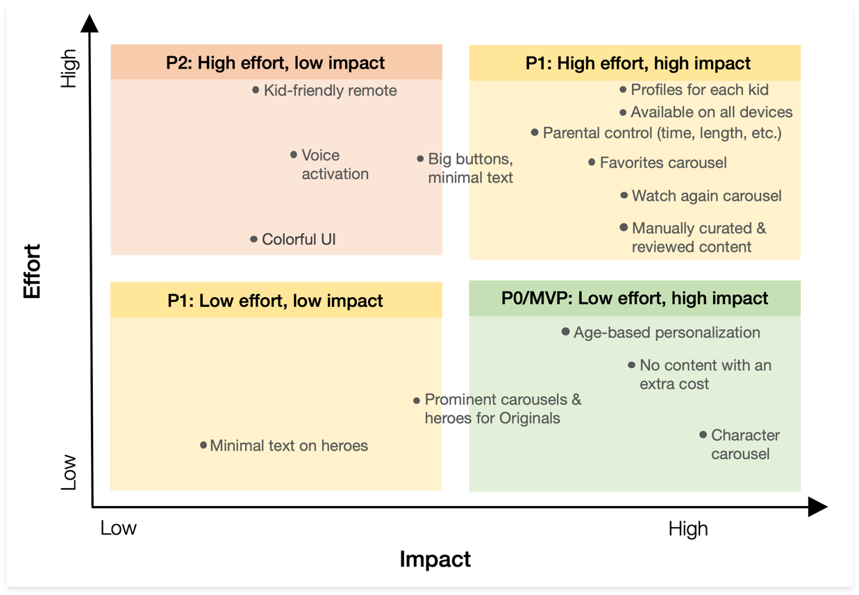
These were the ideas for features that we generated and pinned to a brainstorming board:
Bottom right: Big, easy wins we definitely wanted to incorporate into our MVP launch.
Top right: Difficult challenges, but with big payoff. We'd try our best to complete these.
Bottom left: Small, easy wins with low ROI. We'd get them if we had time.
Top left: Difficult challenges with low ROI. Nice to have but not blockers.
Prioritizing our ideas
Since we wouldn’t have any engineering resources for our MVP product, we then evaluated each of the ideas against a framework of feasibility from a technical perspective and desirability from a user perspective. We charted them to decide which ones we’d definitely release with MVP/P0, which ones we'd do our best to achieve (P1), and which ones were out of scope and could wait till subsequent iterations (P2).
Low fidelity mockups
Wireframing & Content Strategy
To get buy-in from leadership for the kids area, I created a wireframe for tablet, using customer streaming data and interviews to inform my hypothesis about the most valuable content and its hierarchy:
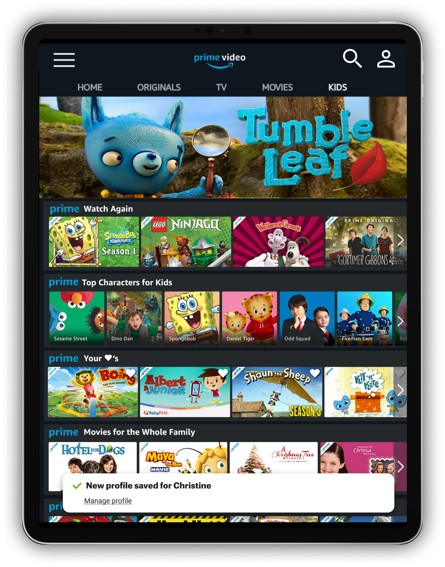
New & featured content: a rotating hero banner with the latest personalized titles at the top of the page, followed by rows of carousels.
Repeat/favorite content: A new feature for favoriting titles would take a significant investment from engineering, and resources were scarce. Instead, I designed a scrappier solution that could be done with minimal engineering work - a personalized “watch next” carousel with the child’s most recently watched titles.
Manually curated age-based carousels: age-appropriate carousels organized by top characters, popularity/rating, and genre, in that order.
Wireframing the layout and order of carousels and heroes
Tablet wireframes
Internal usability testing with Amazon parents
I then created the high-fidelity prototype below using Invision:
PROTOTYPE
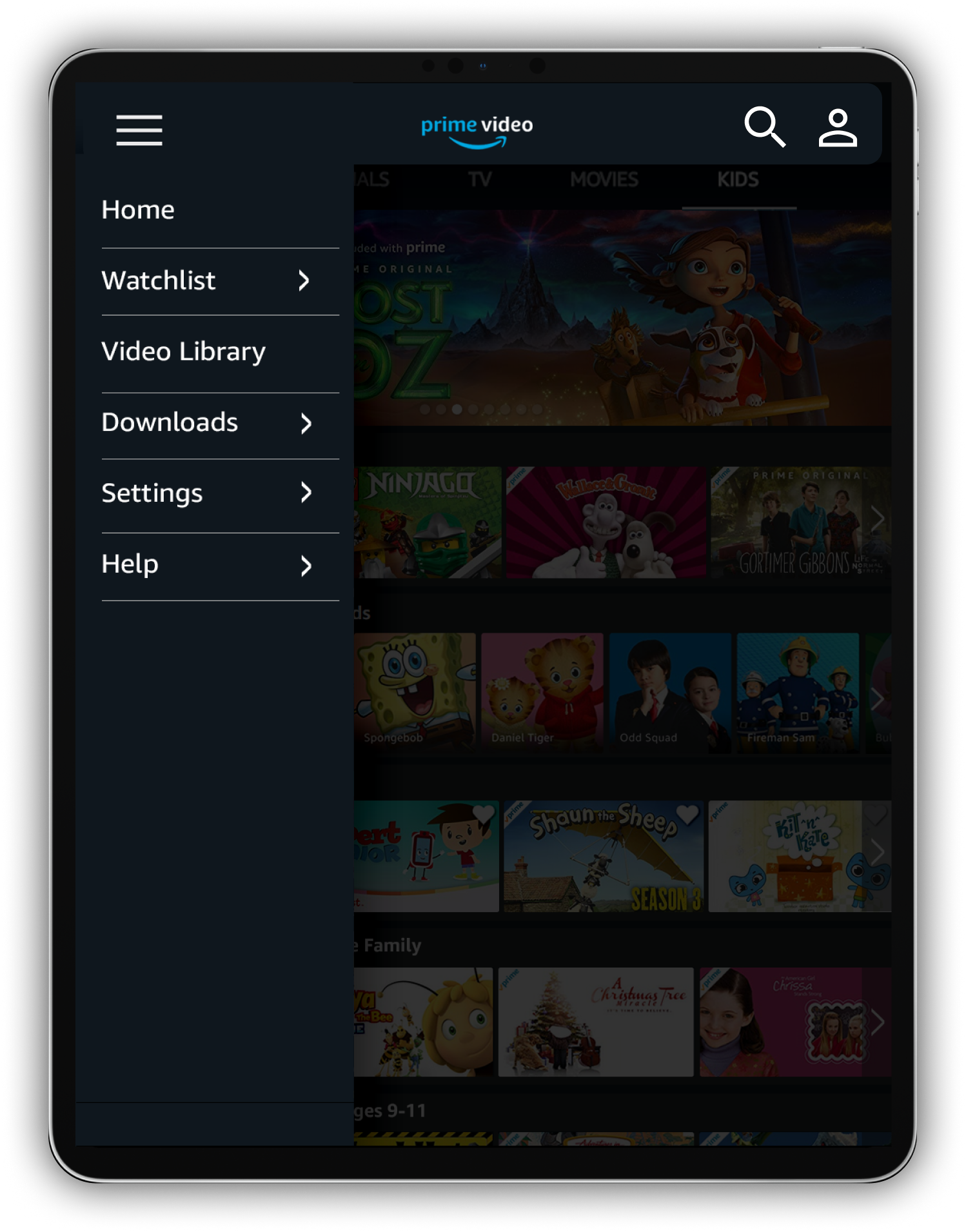
Click the hamburger menu to start the flow
Testing guide: Scenarios and task completion
I created a testing guide (excerpt below) and invited Amazon employees with kids to participate in two large scale testing sessions, with about a dozen parents per session. I had them test from the perspectives of the different personas and scenarios I had defined during the research phase. As the moderator, I walked the room, observed users in action, and asked them to document any pain points and suggestions for improvements. I also asked them to find and use specific features (ex: character carousel).
Here’s the test guide. The bottom half contains responses filled out by one of the parents below:
Usability test results
The participants found very few bugs or problems with the MVP, and they were excited that it was a significant improvement over digging through all content to find something for their kids.
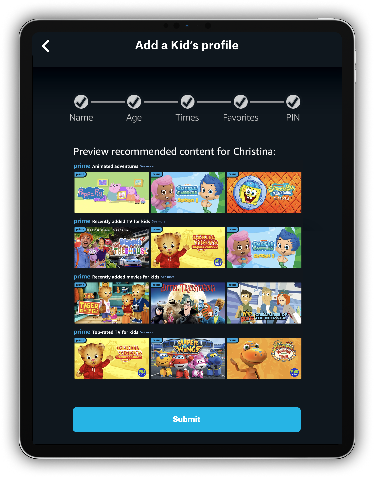
However, they consistently expressed that they wished there were more robust features. For example, they wanted to be able to preview the types of content that their child would be exposed to before saving their child’s profile, and wanted to be able to explicitly approve, ban, or put time limits on specific shows or movies.
Final screens
Once my leadership approved the vision, I then created high-fidelity designs for the remaining platforms: mobile web, Android, iOS, Smart TVs, and FireTV using Sketch.
One of the things I struggled with was how much flexibility to give to parents to set different streaming times depending on the day of the week. For example, some parents wanted to enforce an earlier bedtime on weeknights than on weekends. But to minimize complexity of the setup wizard I decided to limit parents to a single set of times that could be applied to individual days of the week. I’ll test having multiple time ranges for the P1 product.
In addition to mocking up the page itself, I also designed the entry points for the kids area from global navigation, local navigation, and main Prime Video storefront. Our Merchandiser used the mockups to schedule the MVP kids area in a CMS and our personalization team used it to customize the Watch Next carousel to filter out any adult titles.
Parents can use the “Kids” tab to see content for kids, separated from content meant for adults
Parent opens the settings menu
Parent chooses “Kids & Parental Controls”
Parent can modify an existing Kids profile or create a new one
Parent enters the child’s name and selects the appropriate age range(s for their child
Parents use sliders to choose the times of day and pickers to choose the days of the week when their child can watch
Parents create a PIN and choose what they want to restrict: purchases, ability to modify the profile, and more
Parents select their child’s favorite shows and movies, which will appear in the Favorites carousel in the Kids area
Kids can now take the device from their parents and stream personalized content from the kids area
Launch & results
Phased rollout
Since we had positive reception internally for the MVP kids area, we decided to launch it as an experiment.
We enabled the kids area (our treatment) with a limited rollout to 25% of customers, which allowed us to measure the lift to overall kids streaming, get early feedback, and limit the risk of any unexpected, adverse effects on engagement (particularly to non-kids content). The control was the existing streaming experience (no kids area).
Statistical analysis showed an increase in streams and streaming time
Customers who saw the kids area streamed 3% more kids’ titles and 2% more minutes (they not only streamed longer, but more frequently). We dialed up the experiment to 100% of customers once we reached statistical significance with no detriment to streams of non-kids content.
Reftag analysis informed further content optimizations
I also analyzed engagement by looking at ref tag data for each carousel and banner to validate my hypotheses about the relative importance of each component. For the most part, the elements I had placed higher on the page also had the highest streams per click, meaning that the content was optimally ordered. However, there were a few instances in which content that I thought would be popular under-performed relative to their position on the page, and vice versa. I used this data to reorder the content on the page and remove low-performing content.
Commitment to invest future resources in P1 and P2 features
The kids area will require engineering and development work to make the page truly delightful, like adding parental controls with PIN numbers. Based on the success of the MVP testing, the Product and Engineering teams committed resources to develop these P1 and P2 features as part of their two-year roadmap.
What came next…
Optimizing the MVP
Before I left Amazon for another role shortly after the launch, I made recommendations to optimize the MVP kids area within existing technical constraints. For example, I proposed testing whether removing the hero banner would improve engagement, since neither Netflix nor Hulu had a hero banner.
P1 mockups
I also began designing the follow-ups from our usability testing and P1 features on our roadmap. For example, I designed this screen at the end of the profile set-up wizard, which allows parents to preview content their child will see and navigate back through the wizard to adjust settings as needed.
Reflection
The power of a scrappy passion project
The MVP kids area started as a scrappy side project that my PM and I felt passionate about. Kids content wasn’t originally on our leadership’s radar, so we didn’t have any engineering resources in the beginning. But once we quantified the value of the MVP, we got buy-in to invest time and money into building a best-in-class product.
I learned to work with Product and Engineering and to negotiate for their resources with data-driven business reasons. About a year after I left the team, Prime Video created dedicated roles for Kids design, product, and engineering.
Next time: more diverse test participants
I did this project back in 2018. For budget reasons, I stuck to a test of only parents who worked at Amazon. If I could redo the project, I’d push harder to test with a more diverse panel of users, such as stay-at-home parents, single parents, parents who didn’t have a 9-5 corporate job, grandparents, and babysitters, and I’d recruit from cities all over the US. My internal test was biased toward high-earners in Seattle in their late 20’s to mid 50’s, primarily White, with a spouse in the picture.


